ProEdge
Universal cards
While working on the ProEdge - PwC learning platform, I was tasked with making periodic updates to our learning object cards. With over 50,000 active artifacts including courses, credentials, videos, podcasts, articles, and more sourced from dozens of providers, maintaining these cards required careful attention to detail and coordination with various content sources.
Problem
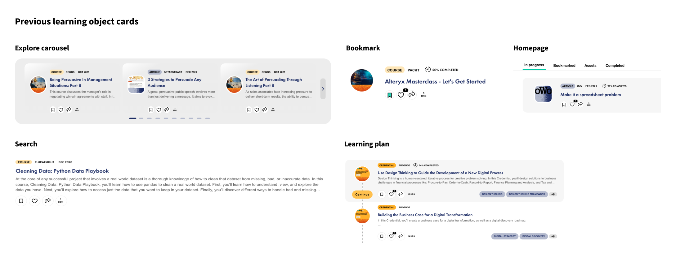
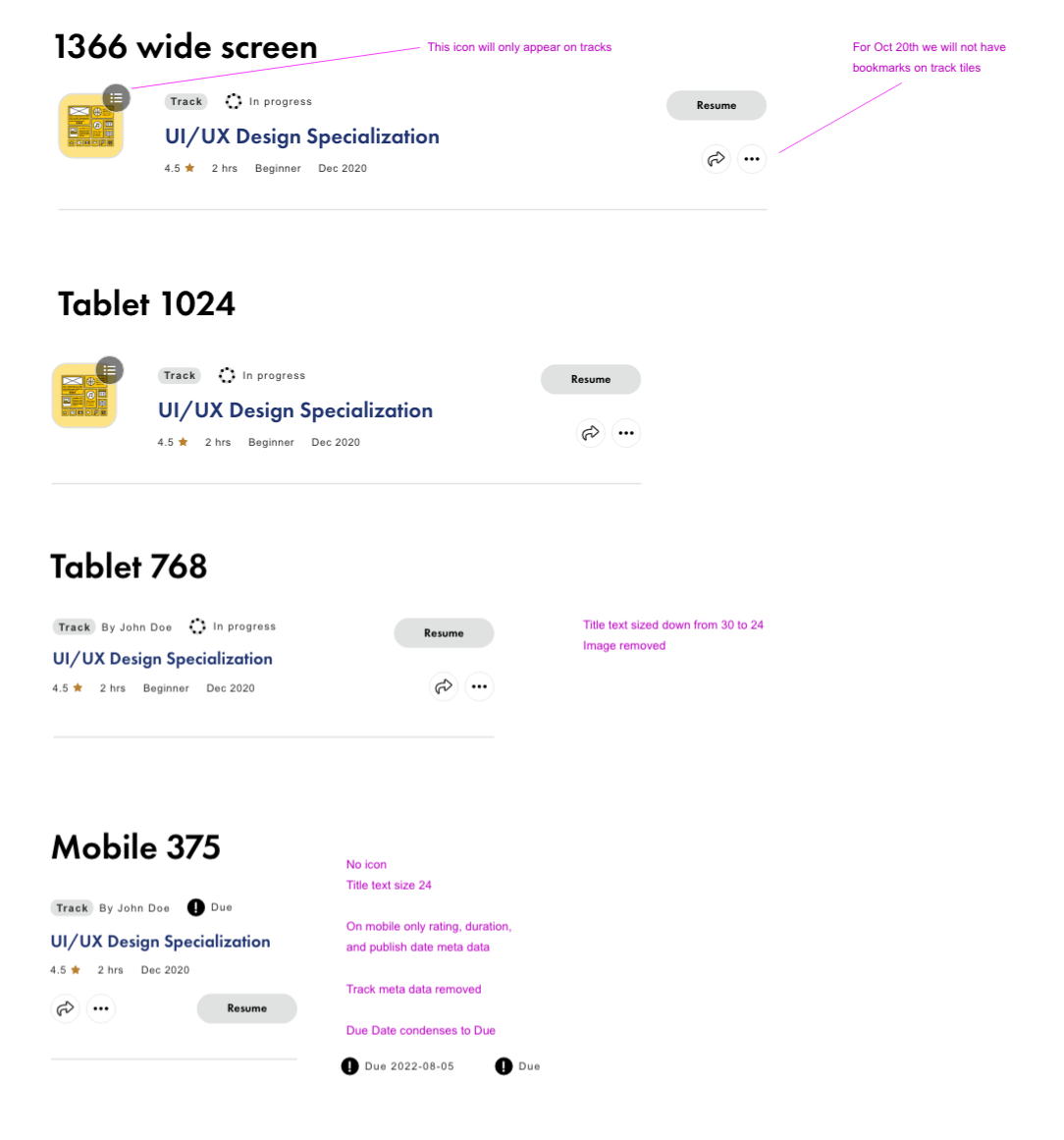
It became evident to me that the learning object cards undergo significant changes and shifts between pages, adapting to the specific purpose of each page. However, the method used is neither scalable nor modular, requiring substantial design and engineering efforts with each new feature or update. Additionally, the different cards do not consistently respond to responsive resizing.
Each content type necessitated a distinct shape, gradient, and label color. For instance, courses employed circular thumbnails with an orange gradient and corresponding content labels, while articles utilized square shapes with a blue gradient, and so forth.
Solution
Add new features
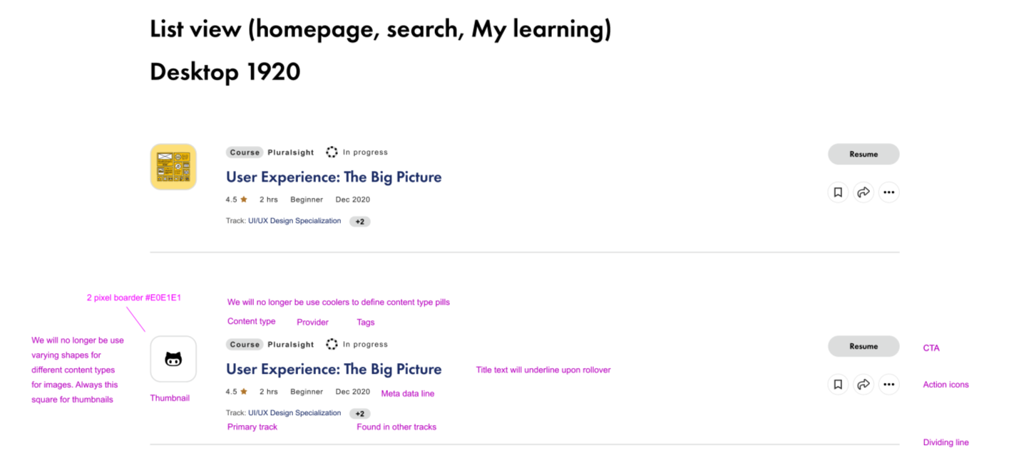
New meta data such as ratings, levels, status were added to better inform the user visually.
Progression tags have been updated and designed to take up very little horizontal space while communicating effectively to the users. They now also visually reflect the percentage of completion. If a provider doesn’t give us access to that information they will get the “in progress tag”
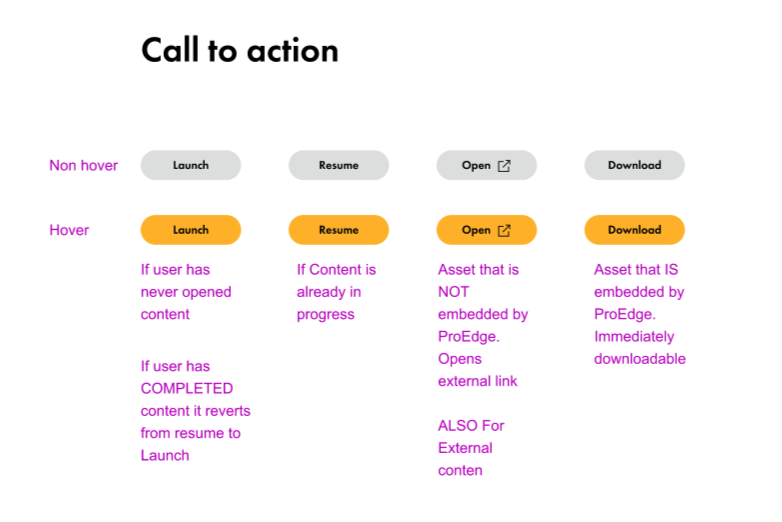
Calls to action were a main requirement from leadership, and now they are also context specific. For example If a user has never opened content, it will get a “launch” CTA, but if they have engaged with the content they will get “resume”.
Reorganize the card
With enhanced functionality and metadata integration, the card layout is now more organized, consolidating metadata and action items for improved user experience.
Action icons have undergone a comprehensive redesign, ensuring cohesion and scalability. For instance, ellipses now offer various context-specific actions, tailored to different sections like the homepage or search. This reduction in shifting or corner jumps of metadata and action icons fosters a consistent user experience and simplifies development efforts.
Simplified and scalable
Previously, various content types were distinguished by different colors and shapes. However, with the addition of new content types, this approach became unsustainable. Now, all thumbnails will adopt a square shape and content types will be indicated in gray. This adjustment will simplify the design and enhance scalability, facilitating the work of both engineers and designers.
Every element now has a designated place and can be effortlessly toggled on or off, streamlining future updates and ensuring a more efficient development process.
Results
This implementation significantly streamlined our design, engineering, and quality assurance processes when adding features across Learn on ProEdge.
Not only will cards across ProEdge be more consistent with each other, but the underlying logic should also be more robust for future implementations, if required. Ultimately, this will result in a superior, more functional experience for end users.


