ProEdge
Enhanced Search
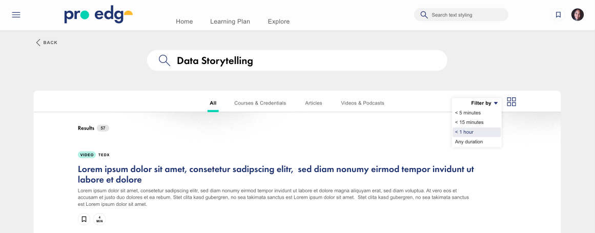
During my time working on the ProEdge - PwC learning platform, I had the responsibility of enhancing the existing search functionality by making it more user-friendly and incorporating a feature that enables users to filter content effortlessly.
Problem
The existing search feature had restricted filtering options. While it could filter content based on its type, this approach lacked scalability since each content type required an individual tab. Additionally, the search function allowed filtering by duration, but it lacked visual consistency with the other filters, as one was a dropdown, and the other was a tab.
Research
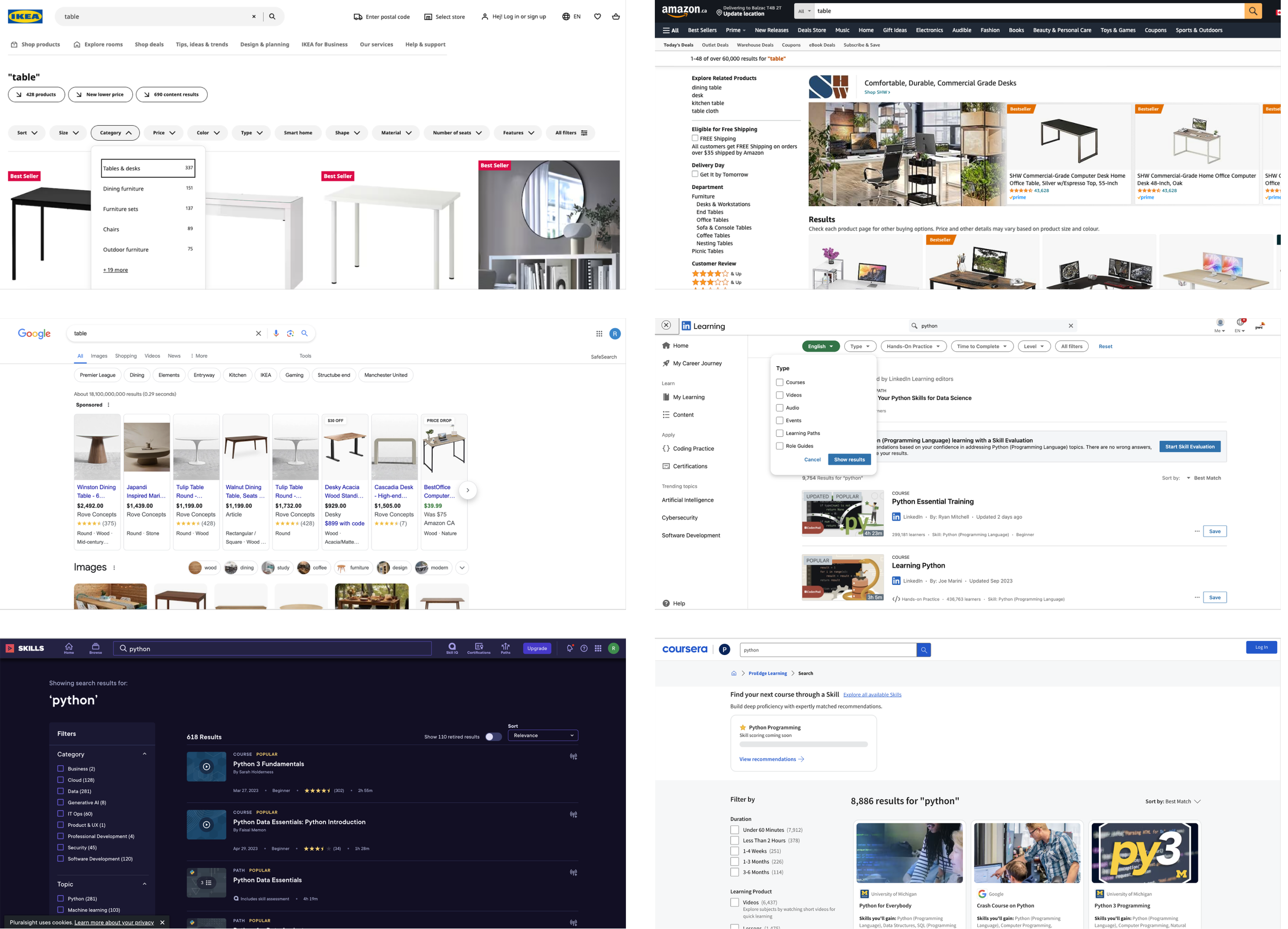
To improve our search functionality, we conducted an extensive review of how other learning platforms, as well as various products, implemented search features. We examined their approaches, paying close attention to their responsiveness and adaptability on different devices such as tablets or mobile phones.
Several platforms used buttons with a tactile appearance to create dropdown menus. This approach would accommodate future expansion and additions to the filter options.
Some platforms utilized a vertical left rail, which encouraged scrolling but may not provide optimal consistency in a responsive design environment.
Additionally, we observed a variety of dropdown elements, including radio buttons, checkboxes, search navigation, or a combination of these three options, providing users with multiple ways to refine their search results.
Reply in a thread
Testing
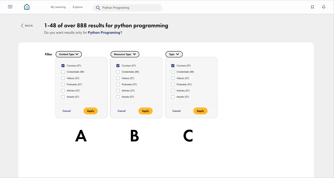
We conducted preliminary testing to evaluate the effectiveness of naming conventions and design functionality. This testing also helped us ensure that users could navigate the prototype with ease.
Solution
Adding filter options
Following numerous discussions with stakeholders and the customer success team, we identified the most crucial filters for our users, which significantly expanded the filtering capabilities. These new filters included Accreditation and asset type, among others. We then prioritized these filters from left to right based on their importance.
Selected filters are displayed as tags below the dropdown menu, enabling users to easily track and remove specific filters or clear all filters.
In responsive designs, the filters would gradually be hidden as the screen width decreased. Additionally, an "All filters" button was implemented, allowing users to access a side panel with all available filter options for a more detailed search.
We collaborated closely with the engineering team to ensure the logic would seamlessly handle any combination of filters. In certain cases, some filter options were disabled when specific filters were activated to maintain smooth functionality and accurate search results.
Additional search functionality
To enhance the search experience, new features were incorporated, such as predictive search (type ahead),
pre-emptive content type selection in the "I'm looking for" area, and predictive suggestions based on skills and roles.
Additionally, an updated "0 results" page was introduced, offering assistance through the explore function and help center, ensuring users receive guidance even when their initial search yields no results.
Results
The search function has been notably enhanced, delivering a more user-friendly and efficient experience. Comprehensive research and stakeholder collaboration allowed us to pinpoint and prioritize key features that substantially enhance content discoverability.
By incorporating predictive search, pre-emptive content type selection, and filter-based suggestions, users can effortlessly navigate and find relevant content. These upgrades cumulatively yield a highly effective, user-friendly, and powerful search feature.


